顯示包含「home price」標籤的文章。顯示所有文章

2023年8月4日星期五

Too much policy meddling trashes HK housing market 20230804

The SAR government’s launches of new housing policies have reached fever pitch in recent years: from Chief Executive Lee’s “Light Public Housing (LPH)” initiative from his 2022 Policy Address to this year’s resumption of “Private Sector Participation Scheme (PSPS)” that was abandoned in 2002, to the launch of Transitional Housing (TH)… All this begs the question of whether the government has a well laid plan for the long term, or just reacting furiously to show it is doing something to the rising home prices (which has now turned down)?

The stronger the price rises, the bigger the temptation to interfere

Your correspondent has charted all the major public housing initiatives of the past 60 years so as to demonstrate cause and effect, and to illustrate the motives and timing of their launches. The result is clear: whenever major tinkering is made to housing policies, it is often after sharp surges (see brown arrows in Chart 1) or falls (green arrows) in home prices, for example:

a)      The introduction in 1977 of the Home Ownership Scheme (HOS) / PSPS (brown arrow A) was after some 133% rise in home prices between 1971 and 1976 (see dotted line 1 on the property price line); this was followed by

b)      The Middle Income Housing launch in 1980 coinciding with the end of another period of strong price increases (dotted line 2), but then hastily cancelled in 1984 (green arrow B) when the upcycle turned downwards after a final surge towards the 1981 peak (dotted line 3); likewise,

Chart 1: A timeline of Hong Kong’s major public housing schemes changes

a)      The continued home price surge between 1985 and 1994, catalysed several further housing schemes (Home Purchase Loan Scheme, Sandwich Class Housing, see brown arrows C-D), as well as the final blast to mark the peak: the Tenants Purchase Scheme, Buy or Rent Option, and even Mortgage Subsidy (arrow E), all launched before the bubble burst in 1997 (dotted line 5);

d)      It was only after the 70% the collapse in home prices around the SARS bottom that the government hurriedly withdrew as many as five housing interventions (green arrow F)!

New up cycles, new intervention temptations

Since the 2003 lows, the return of a housing upcycle (dotted lines 6+7) yet again lured the authorities to launch several rounds of new measures in an attempt to be seen as ‘doing something about affordability’, these included My Home Purchase and the so called ‘practical but not extravagant’ new variety of HOS  (brown arrows G+H)… go figure the multitude of nuances in all these fancy layers of welfare!

Sadly for the mandarins in charge, the global zero interest rate environment pushed property prices to even loftier heights, to finally reach a triple top in 2019-2022. This unacceptable situation had to be stopped, so in a flurry of new initiatives, we saw Green Form HOS, White Form Secondary Market, followed by LPH/ Private Sales Subsidised Sale Flat Pilot Scheme/TH amongst others (brown arrow I). All this illustrates is how confusing and short-sighted our housing policy has been, with disappointing absence of logical philosophy on housing welfare provision.

Recent months, the increasing intensity and proliferation of initiatives echoes the same panic last saw in the 1997 peak, presaging that another major top may be in place for this cycle (cf arrow E vs arrow I): at the time of writing, prices have fallen by 12% from the September 2021 highs. Your correspondent fears that in another year or two, there may be a repeat of policy U turns saw at the last major bottom (ie green arrow F vs arrow J)…

In order to illustrate the point on this predictable cycle, we plotted the cause of policy actions (i.e. private home prices, see the blue line in Chart 2) against the symptoms as expressed through the political pressure (quantified by say the PRH waiting time, see green line), and then the result being the number of government interventions (red line). There is an eery correlation of the three:

Chart 2: Home prices leads PRH waiting time, which impacts the intensity of government’s meddling in the housing market

The general pattern seems to be that the number of public housing schemes (i.e. the frequency of market interventions) fluctuates with the length of PRH waiting time; and the latter reflects of the swing between greed and fear as property price fluctuates. The blue line in Chart 2, being a lead indicator, suggests that as the decline in property prices continues, average waiting time will also recede, to be followed by the phasing out of various government schemes around 2025-7 (ie red line will turn down too).

What the above chart also suggests is that government policies are always too little too late, what the various recent interventions/initiatives are already 3-4 years too late, and the drop in home prices will mean that these policies are yet again pro-cyclical, ie increasing price/demand volatility rather than solving the root cause of the problem.

Simple is beautiful – learn from Shenzhen?

Hong Kong’s housing welfare policy/administration has long been held hostage by various vested interest groups, leading to endless proliferation of conflicting policies which only complicate and confuse the people. But across the Shenzhen River, our neighbour has a much simpler public housing set up, with only three layers and minimal overlap with the private market. This enables much more focused welfare delivery with less wastage – a real breath of fresh air indeed:

Chart 3: A timeline of Shenzhen’s major public housing schemes changes

Even though housing policies in Shenzhen seem to be driven strong property price moves just like in Hong Kong (see arrows a-c), but changes to old schemes are accompanied by abolition of obsolete schemes that no longer work. This is strong contrast to the dazzling array of overlapping complexities that typify Hong Kong’s set up.

As a further example, Shenzhen plans to supply/allocate 80,000 welfare housing units (c. 4 million square metres in gross floor area) and 60,000 private units (c. 6 million square meters) in 2023. This translates to a public : private unit and floor area ratio of 4:3 and 4:6 respectively; compared with Hong Kong's overkill target ratio of 7:3, Shenzhen appears to have a freer housing market!

Policy back to basics: abolish HOS, reduce PRH

Since 1965, Hong Kong has launched a total of 18 public housing schemes, of which 10 are still in force (Chart 1), but the housing problem has only worsened. Not only has public housing policy been widely criticised for exacerbating housing shortage, but has had the adverse effect of HOS breeding more of the “poor” and the “lazy”; this is detrimental to social mobility, but also wastes vast amounts of social and monetary resources.

In view of this quagmire, the government should radically reform as soon as possible:

a)      to make available all HOS stock to the private market, this will immediately enlarge supply and can rapidly bring property prices back to more affordable levels; and

b)      limit scope of PRH to the most needy, vulnerable group in society (rather than the current 35% of all population!); by releasing land to the private leasing market, even the high rents we see now stand a chance of moderating, thus lessening the pressure on the government to engage in counterproductive market interference.

Chart 4: existing housing benefits a sore sight of complete mess


Chart 5: rationalised housing benefits led by private sector removes need for intervention 

If only the government would allow the invisible hand to allocate supply/demand and prices in housing like so many other commodities are permitted to, then the reason for the existence of such a mess and policy nightmare as shown in Chart 4 vanishes. When returned back to basics, the government’s role will shrink to operating a basic safety net (red area in Chart 5) of physical shelter provision, and perhaps as a transition into the private market, a limited extension into rental vouchers but limited to say 10% of population. This way, even the voucher recipients get freedom of choice in finding the right homes in the right districts, and at the right prices according to the welfare beneficiary. Such an elegant solution will also forever eliminate the endless expansion of bureaucracies, sluggish liquidity/mobility in the housing market, and of course the constant exploitation of an unfair welfare system – a blessing for Hong Kong from every angle one views.

A truly flexible, effective and fair proportion of housing provision by the public sector should be as low as possible, and by no means the 7:3 ratio under current policies (as indicated by the red arrow in Chart 6), by providing low-level safety net physical housing (green arrow) coupled with monetary subsidy for the next poorest group. If Hong Kong continues to imitate badly what Singapore does for its own specific social political reasons, it will only be further left in the dust by a younger, more dynamic neighbour in Shenzhen!

Chart 6: The proportion of public housing is surging again, bad news for future freedom of Hongkongers…

For a revision of some of your correspondent’s past analyses on Hong Kong’s housing welfare, here are the links to recent publications for your reference:

HK’s Ever Ballooning Public Housing Addiction Cycle 11/2021 (Web, Blog, LinkedIn)

as well as some earlier writings in Chinese:

居屋政策 好心做壞事 20147English Google translation (Web, Blog)

公屋改革面面觀租金偏離市場20149English Google translation (Web, Blog)

公屋改革面面觀結構性自我膨脹 20149English Google translation (Web, Blog)

公屋改革面面觀公屋「豪宅化」201410English Google translation (Blog)


The author would like to thank Alice Yurong Zeng from the Chinese University of Hong Kong majoring in International Business and Chinese Enterprise for assisting in data collection, analysis, and drafting this article.


2022年9月30日星期五

Which US states are tax friendly… and cheap? 20220930

 As interest rates spike and cost of living crises bite across the world, it is even more important now to choose one’s investment (or living) destinations carefully. On top of the usual comparisons of tax rates between jurisdictions (see earlier article “LowerUS State Tax Drives Population Inflows, Home Price Rises”), this article employs a slightly different angle – the composition of tax takes between host governments. We undertake this exercise using Tax Foundations’ data which breaks down state tax income by four main components: corporate income tax, individual income tax, sales tax, and property tax.


Preferring low income tax and fair individual-corporate balance

For most income earning job holders who may also be home owners, it may be reasonable to assume that they prefer paying lower income tax. On top of that we would also assume that when individuals are paying similar (or lower) levels of tax compared to companies, the smaller guy (individual) would be getting more fairly treated or allowed more individual liberty.

One way to quantify these preferences is to plot these preferences on a scattergram using two measurements:

  1. Higher sales tax take vs income tax – meaning more of the government’s income comes from consumption rather than savings, thus encouraging investment for longer term if not implying low absolute income tax rates, this is captured below on the X-axis;
  2. Lower individuals tax than corporates – put another way, this state of affairs results either when there is a booming corporate sector (leading to higher corporate income taxes) or when the resident individuals get to keep more of their salaries/profits instead of just the big corporates being able to do that (as they have the clout/resources to negotiate/threaten govts into large tax concessions) – this metric is captured on the Y-axis:

Chart 1: higher sales & corporate tax takes vs individual taxes are ‘good’, and vice versa

The spread of the scatter is surprisingly linear, and we have highlighted the ‘desirable’ end of the spectrum in red – states that fall into this category include: Texas, Wyoming, Nevada, Washington, South Dakota, Tennessee, Florida, Alaska and New Hampshire.

On the other extreme (the high individual tax states) we have these ‘bad’ states in purple: Oregon, Maryland, Massachusetts, and Delaware, Virginia, and New York.


States with low income tax AND low property tax

For property investors, lower property tax burden is also an important consideration, so this is what we did next - bombining the two metrics from last section into one (now represented by % sales tax + % corporate tax - % individual tax x 2), and then comparing the result to the proportion of state tax income from property. The results are shown in the chart below:

Chart 2: winners from last section which are also low property tax states – represented by red text in orange shade

The results are interesting – the number of states that meet both low income tax and low property tax criteria now falls, with Tennessee, Nevada, Washington, South Dakota, now the remaining front runners and Florida just scraping in. A new entry however has popped up in the form of New Mexico (represented as N.M. above), which has one of the lowest property taxes (plus great weather) so may well be a good choice too for investors who are not earning a big income? On the opposite end of the spectrum (unfavourable individual tax states), Delaware has lower property tax burdens also, but probably not ideal for the average middle class property owner given its reputation of being a corporate tax haven… the other regulars which score badly on both fronts are Oregon, MA, and Montana.


Internal migration proves thesis right

To prove our hypothesis that the above identified low tax states are indeed attractive, we take a look at how domestic migration played out in recent years. As a percent of state populations in 2017, we look at the proportional net internal migration numbers and use this statistic as a proxy for how people either flock to, or flee from individual states. Here are the results

Chart 3: Low tax states attract population inflows

Perhaps not surprisingly, our ‘attractive’ states (in red text) invariably saw net domestic migration versus the high tax states (purple text) seeing outflows. So our top 3 states (from Chart 2) are also states here with the highest population inflows (Nevada, Florida, Tennessee), whereas the bottom states also saw meaningful outflows (Maryland, New York, and MA).


Housing price to income ratio

To add icing on the cake, cities from some of our top states also appear on the cheapest housing market list – according to the 2022 Numbeo home price to income ratio rankings, the good affordability cities (ie with low multiples and high rankings) seem to feature our top states from the foregoing analysis, while the reverse seems to be the case for the expensive cities. In the chart below, the number in brackets after the city is the ranking number out of 40, and the colouring follows the same scheme we have used in the earlier charts:

Chart 4: Home price to income ratio – affordable tax states also have affordable homes?

This may sound too good to be true, but if the trend of continuous inflows persist, perhaps the cheap home price states will not stay cheap for long…


The author would like to thank Jasper Tan Cheuk Him from The University of Hong Kong majoring in Economics and Finance for assisting in data collection, analysis, and drafting of this article.

2022年9月20日星期二

Reiterate UK sell – prospects dimming fast 20220920

Since our 13th May bearish call on UK property, things have not improved on any front, and in this report we update some important macro factors that have either added or worsened the property headwinds the UK is facing. We urge investors to speed up their disposals before it is too late to do so.

Several of the key factors impacting the outlook of UK, and in a sense Europe at large, continue to play out and the current lull (helped by both summer warmth and a temporary correction in energy prices) may reverse unexpectedly when winter arrives. Here are what could happen:

  1. Energy starvation undermines livelihoods, triggers civil unrests?

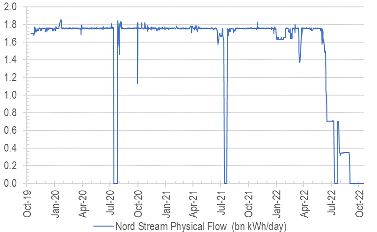
The unfortunate situation Europeans find themselves in can best be described as  a combination of: a) political grandstanding in Ukraine where sanctions beget retaliations (energy & food shortage) from its biggest supplier (Chart 1), while b) the zealous embrace of fundamentalist ‘green’ energy policies without having backup plans worsens the hardship that can potentially explode on to the scene.

Chart 1: Nordstream gas turned off – is it lights out for Europe? Source: Nord Stream AG

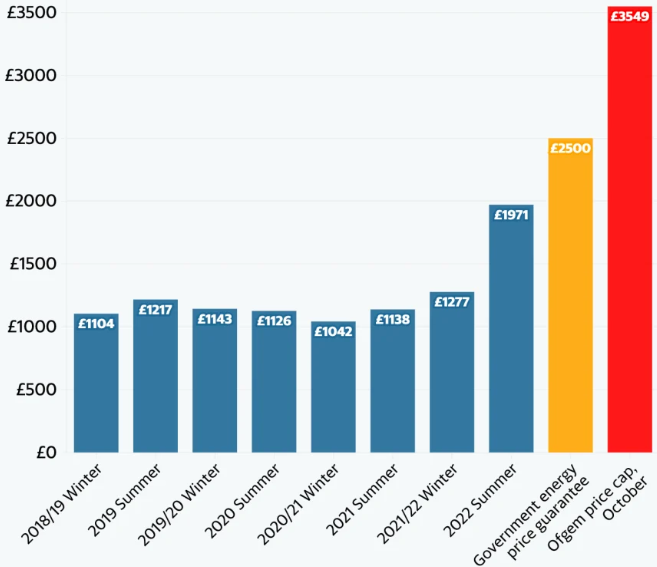
Focusing just in the UK, our subject market, where 40% of electricity is generated from natural gas in 2021, the energy bills for households and businesses are going vertical (Chart 2). An outcome that would have been avoided if the UK did not gleefully hitch the joy ride that expansionist/hawkish US / Nato policies brought about when diplomatic solutions have been in place since 2014 (ie the Minsk Agreement brokered by France and Germany).

Chart 2: UK gas prices tripled vs a year ago

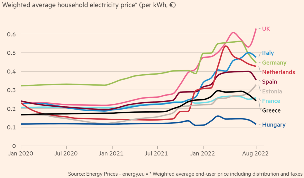
Chart 3: UK electricity price highest in Europe

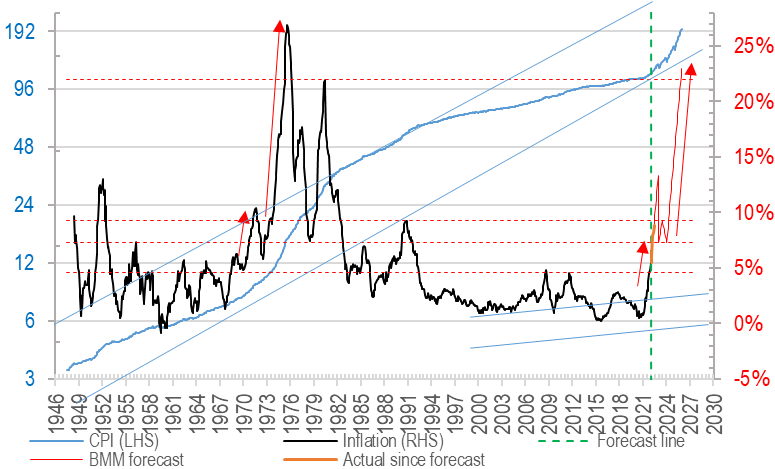
Now European countries not only have to suffer manufacturing stoppages due to energy shortage, but also issue even more debt to relieve household energy hardships at a time when cost of funds are exploding (more below), all while spend unnecessarily on a costly arms race in an unnecessary war which benefits mostly foreign (ie US) energy and munitions producers. This is as close to a perfect storm as it gets, coming on the heels of devastating lockdowns that has destroyed the SME sector in the past three years and ushered in record high inflations (also expanded later, Chart 3) even before the war began…

Chart 4: UK inflation: tracking the the crazy 70s inflationary cycle?

2) Interest rates bursting out of CB control

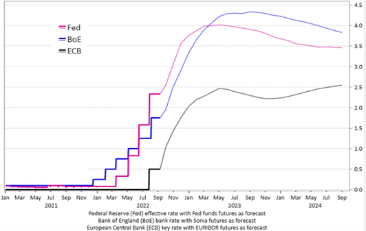
As the Fed aggressively pursues neutralising rates after years of QE, the rest of the world is dragged along with it, with many EM countries flirting (if not already in) double digit interest rates territory. In the UK alone, it is widely expected now some 250bps of hike is on the cards by Q3 2023 (Chart 5), we fear that might appear mild if the sovereign debt crisis worsens.

This will force a repayment crisis for any home owner on high LTVs who will already be seeing their disposable income drop due to high inflation.

Chart 5: Central bank rates in the west projected to hike
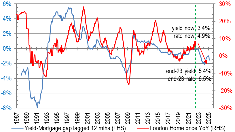
Chart 6: rental yield lagging mortgage – negative for prices

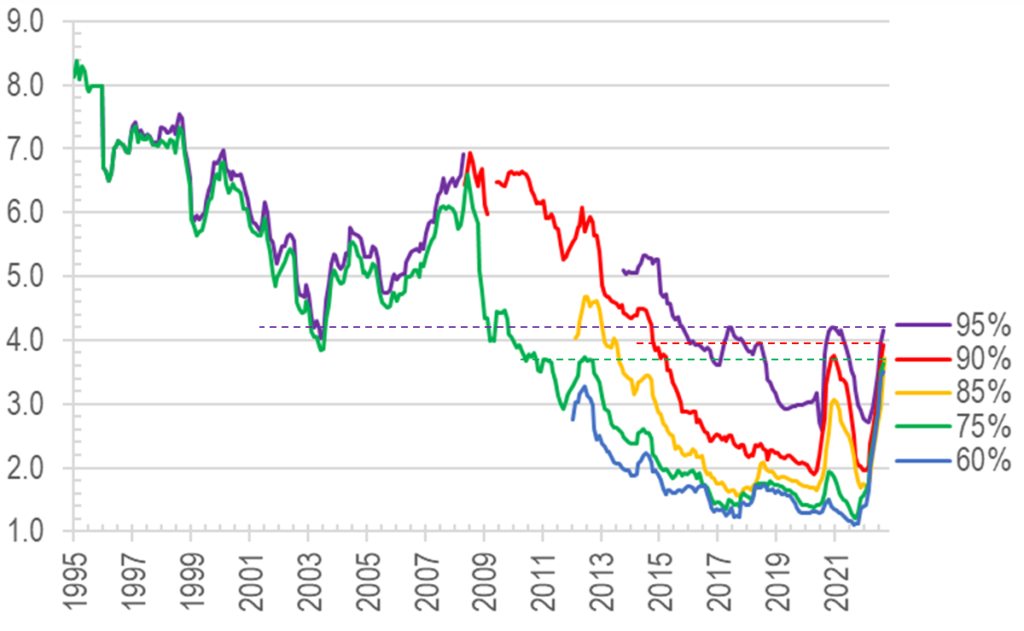
As a result, property yields will have to rise either through big rental hikes (eg in Chart 6 above, c.60% if prices were to stay flat) or some meaningful price corrections heading into 2025. This hike in funding costs will hit even owner occupiers (who may be less concerned with yields discussed just now), as their repayment instalments have only just taken off, and could see multi-decade highs ahead, here is a taste of the rapid ascent and what it looks like:

Chart 7: UK mortgage rates by LTV levels - variously at new highs since 2002-2015

3) Economic shrinkage unavoidable? Unrest/war wildcards on top…

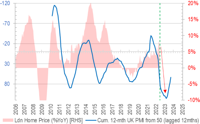
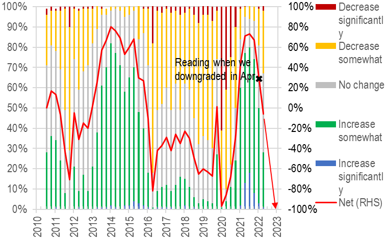
Given the set up of these very unpalatable cocktail, it is unsurprising that our sentiment momentum tracker is suggesting price drops into H2 2023 (Chart 8) and finance directors are getting more bearish (see Chart 9 – again, we expected weaknesses ahead back in May, but this may persist for a few more months to come), which can spell trouble for investments and consumption ahead.

Chart 8: Fast dropping PMI bodes ill for home prices
Chart 9: CFO survey – weak sentiments weakening further

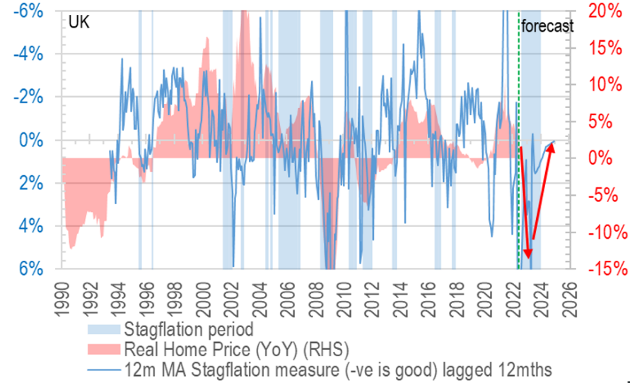
To put all of these indicators on one consolidated view, it is helpful having our ‘stagflation chart’, which encapsulates both the expected weak (if not negative) household income growth and rising unemployment, we see a lot of downside risk indeed:

Chart 10: Stagflation flags point to real home price to fall in 2023-24

4) The weaker the GBP, the more imported inflation – a vicious cycle?

On top of the lacklustre macro picture overall, the currency headwinds are not to be overlooked either – as UK suffers the multiple disadvantages of wrong geopolitics and woke/green misadventures, less investment will head for the British shores, or if there were fleeing EU money, they may bypass the British Isles this time and head straight for the USA instead.

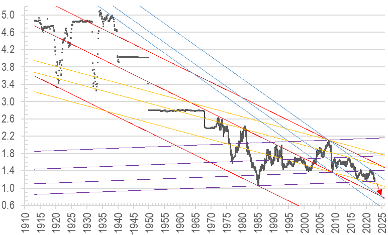
What this means is that, especially for foreign investors (which is everyone buying UK property from HK), more currency losses are possible on top of price drops in local currency terms. In fact latest falls in GBP has broken a long term support level that hs held since the 1980s:

Chart 11: GBP could fall another 25% by 2025 after piercing long term support

With this major technical breach, we could be looking at the pound reaching 80 cents on the dollar within the next two years, or another 25% devaluation. A familiar Christmas carol paints a serene scene like this:

In the bleak mid-winter
Frosty wind made moan;
Earth stood hard as iron,
Water like a stone;
Snow had fallen, snow on snow,
Snow on snow,
In the bleak mid-winter
Long ago.

Let’s hope this scenario does not come true this winter…and the politicians will have the wisdom to reverse so many bad policies that could result in just such a bleak mid winter indeed.

2022年5月13日星期五

UK property – time to sell? [Article 1 of 2] 20220513


UK property – time to sell?

UK has been a good market for many HK investors, especially those who bought after the lows of GFC. Your writer has done even better by focusing on fringe markets which continued rising even when the prime central London sector crashed since its peak in 2014 – some popular development projects there having fallen by as much as 50% since:

Chart 1: prime central London underperformed by 14% since 2014 peak vs Greater London…


But with a plethora of negative factors now taking centre stage politically, economically, climatically, and on valuation grounds, we think the prospect of future rises, let alone outperformance, of the UK property market, is now much dimmed. Below is an extract of a longer piece we sent to clients, some key reasons for our cautious views are as follows:

1) Energy / food / hyperinflation => drop in real income, rise in civil unrest

2) Debt explosion + Rate surge undermining returns

3) Taxes must rise to service the rising rates, unsustainable welfare, and military spending

4) International wars cause capital flights (to US/Asia) and disrupt business

5) Chasing out the rich – the selling has just begun? e.g. Superman Li. The Saudis, Russians, and Chinese may not return if the seizure of private assets continue

6) Regulations Overload is becoming unbearable – for property investors

7) Positive immigration inflows may reverse after Brexit

Below we will look at all these factors in more detail.

1) Massive energy/food inflation drains disposable income, may trigger civil unrest?

The UK/EU construct, being heavily manufacturing and trade dependent, cannot afford to lose reliable and cheap energy imports, which was badly hit by supply shortages following covid lockdowns. This is now worsened as geopolitical tensions explode.

Just about every essential commodity, manufactured good, and service (eg imported labour) is now at critically low levels, stoking massive price hikes sometimes in triple digits. For example: reserves of arabica coffee, the higher-quality bean loved by espresso aficionados, have fallen to their lowest level in 22 years… prices on the ICE futures exchange rallied as high as 2.55 in Q1, up 140 per cent from 2020 lows:

Chart 2: Coffee inventory at multi-decade lows, and could worsen further as fertiliser/transport costs continue spiking

There has been widespread coverage of the energy shortage and price spikes so we will not go into detail here, one example being ominous The Telegraph warning on 18 Nov 2021 – well before even the Ukraine conflict broke out:

We are back to warnings of power rationing and industrial stoppage, a looming disaster for the European Commission and the British government alike

[Gas] Inventories are currently 52pc in Austria, 61pc in Holland, 69pc in Germany at a time of year when they should be near 100pc

Chart 3: UK less affected by Russian imports, but still can’t escape rallying global prices


UK is not as safe as the chart above suggests, as cross-Channel prices move in near lockstep, and the fact that the government allowed storage sites to close means the country may be nakedly exposed with just days of stock.

Further, the Hinkley Point C nuclear power station will not come on stream for another five years at best, and have banned, since 2019, fracking to extract easy oil resources.

Edging private sector to invest in fossil fuels is now more difficult than ever: ten years ago, the "cost of capital" for developing oil and gas was similar to renewable – at between 8% and 10%. Now, the threshold of projected return that can financially justify a new oil project >20% for long-cycle developments, vs renewables falling to 3%-5%, according to Goldman Sachs.

Chart 4: Cost of capital: very costly to start fossil fuels projects due to politics and ‘green imperative’ mentality

Why so high? Simple. Few want to lend to fossil fuel producers as stakeholder capitalism, ESG mandates, and identity politics infest corporate boards.

2) Debt explosion + Rate surge undermining returns

The West has sleep walked into a vicious cycle of:
(a) high welfare =>
(b) higher debt =>
(c) higher taxes when can’t borrow =>
(d) cut interest rates to -VE when can’t raise tax =>
(e) to buy political support, increase welfare (ie back (a))

This trick was easy to pull off from the early 80s when interest rates were as high as 15%, but now with EU at negative rates compounded by massive inflations every way you look, the game is OVER.

A slight increase in rates – when EM countries are now well equipped, after having gone through their own versions of debt crises (eg Asian Financial Crisis) – will cause the West into a painful reverse trade that threatens to rapidly unwind the past 40 years’ profligacy.

In the case of the UK, public debt has gone from 20% of GDP to 100% over 30 years (Chart 5), but all while interest payment fell from 10% of revenue to 3%. All of these are coming to a head now with collapse in confidence in public debt, triggered by govt mandated economic lockdowns, zealous push for green agenda, and now international wars:

Chart 5: UK public debt as post-war highs


Chart 6: Thanks to rate manipulation

The optimistic forecasts of OBR are probably based on low rates, low inflations, and strong growths after coming out of the lockdowns, but all of these assumptions are severely challenged, which could mean a debt explosion from the highest level since the 1960s to much higher levels than forecast below:

Chart 7: UK debt forecast likely too optimistic

Coupled to this the economy destroying zero-carbon ideology feverishly pursued by most of bureaucrats and politicians, the UK could see as much as 60ppts more in debt load in the next 30 years:

Chart 8: Climate change scenarios: public net debt impact by 2050-51

As international interest rates head higher, the ability of the slow growing OECD (mostly EU) to hold down their risk free rates will evaporate, as capital leaves seeking better returns elsewhere – all of this will lead to much higher finance costs for property very soon. The strong inflation backdrop (Chart 9) is also probably grossly under-estimated by the market, where low to mid single digit forecasts are still the norm, when we are already potentially looking at as high as 20%s levels (especially the 70s oil shock pattern repeats):

Chart 9: with war added to the mix of energy + food crisis, we fear UK inflation could reach double digits soon


Chart 10: Fed projected to hike 300+bps in next 1.5 years

If The Fed’s hike trajectory (300bps in 12 months) is anything to go by, given a weaker GBP (which means more imported inflation) plus higher energy uncertainties compared to continental USA, 400bps+ rate increases are a high probably outcome to us:

Chart 11: yield gap analysis suggests possible price falls 

As a result, even modestly assuming 300bps mortgage rate hike (Chart 11), the low property yields of today will feel a lot of pressure to catch up. Expanding yields mean higher rental growths are needed (69% in above scenario) just to keep prices from falling!

3) Taxes must rise to serve the rising rates, unsustainable welfare, and military spending

Part of the problem of high inflation and high interest rates is the erosion of profits at the corporate level and take-home pays at the individual level. It is no wonder that the government’s own forecast project the highest tax-to-GDP level since WW2 (Chart 12), adding insult to injury after the first two drags on people’s income:

Chart 12: tax take as % of GDP up 8ppts from 80s lows


Chart 13: 2019/20 to 26/27 tax increase by factor

All of this is in addition to the economic rebound nearing its peak, when corporate expansion intensions are starting to reverse:

Chart 14: CFO expansion survey – growth may have peaked

As rates rise, and inflation and tax bite, people’s take-home pay will likely drop, leaving them less money to invest in property, and we expect the record high P/E ratio (home price to earnings) to also turn south (Chart 15), perhaps having first made a dash for new highs by as late as Q3 2022:

Chart 15: Home price to income ratio also may peak by Q3 22

Looking at the complex picture in one condensed chart, we factor in income growth and interest rises against real home prices (ie after inflation) below, we present two possible scenarios:

1)      optimistic outcome where home prices stay unchanged (blue solid line, Chart 16) - the combined effect of inflation and income growth will make home prices a lot more affordable by 2026 (red sold line);

Chart 16: yield gap analysis suggests possible price falls 

2)      but what if the cycle we see in the red line repeats itself, and the red dotted line plays out by 2024 at the 700 reading on the real home valuation index? Such an outcome would require a home price drop of 37%, as represented by the blue dotted line.

The only possibility for home price drops not to happen is if income rises more than inflation (unlikely) and rate hikes are much less forceful than we forecast (also not high chance)…

Although our forecast contains a lot of forward assumptions, what we know for sure also is that the market has been too blasé about how the govts and central banks will be able to keep everything on a steady straight line (very typical mandarin thinking).

In the next instalment
Our discussion will continue in a second piece shortly, in which we will go back to more descriptive mode and go through some of the more real life examples of how and why owning and investing in property in the UK is now much more an uphill struggle compared to the ease it used to be barely 10 years ago... This aspect will very much weigh on the global collective sentiment towards this asset class going forward.


The author would like to thank Benson Kong Yu Chin of The Hong Kong Polytechnic University for assisting in data collection, analysis, and drafting of this article.